To know more about Chinese Website Design, contact us at dx@daxueconsulting.com
This article focuses on the general and basic “cultural/localization aspect” that denotes why Chinese website design (Chinese UX design/ Chinese UI design) is different from the Western UX design/UI design. Deeper understanding of the specific cultural differences between the “East” and “West” website design would be highlighted in the next post.
Chinese website design – More than 1.3 billion users with different needs
The Chinese population is huge and users from different provinces from China need some convenience to gain access to different possessions from different provinces all in one platform 58.com, a Mainland China’s largest online marketplace serving local merchants and consumers, enables local merchants and consumers to connect, share information and conduct business. The success of a cluttered, complex, and noisy 58.com website might have some underlying good reasons, and something might have done right due to its huge traffic, user base and success for the Chinese website design.
Why do Chinese consumers like to go there?
While in conversation with several local Chinese, they stated that as long as they can benefit from the website in saving time; that includes job hunting, looking for a rental home, selling second hands stuff, house cleaning, and entertainment. Users will have the ability to post their CV online, sell a used car, even pets or unused movie/concert tickets. The industry coverage of the portal is really wide, as it covers job search to second-hand item selling and etc.
It is a kind of combination of “job hunting website + “e-bay” + diverse industry portals” where you can find everything you need in one go, while the Westerners will go to many websites for purchasing different items.
In other words, 58.com Chinese website design is a complex and giant version of Gumtree, UK. Gumtree is a complex and giant version of Craigslist USA. However, having said that, 58.com is a very Chinese localized website that there is no a direct similarity to the Western version.
Unlike in the West who might think that the Chinese website design is really noisy, complex, and cluttered. Western countries like the sense of inner social circle, in contrast, in China; you will find lots of exchanges of conversation. 58.com is an online version of an offline “Chinese wet market” where sellers and buyers gathers, which makes the deals between person “A” and “B” easier, quicker and faster. To put it into context, when there are people, there will be business opportunities.
Chinese are holistic minded people with different cognitive reasoning than the Weste rn counterpart
For Chinese entertainment websites and Chinese website design, you will find that these websites look noisy yet entertaining – always something freshly going on, big flashy graphics, advertising etc.
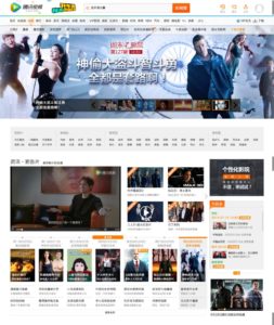
Let’s take Tencent QQ movie (www.qq.com/) as an example.
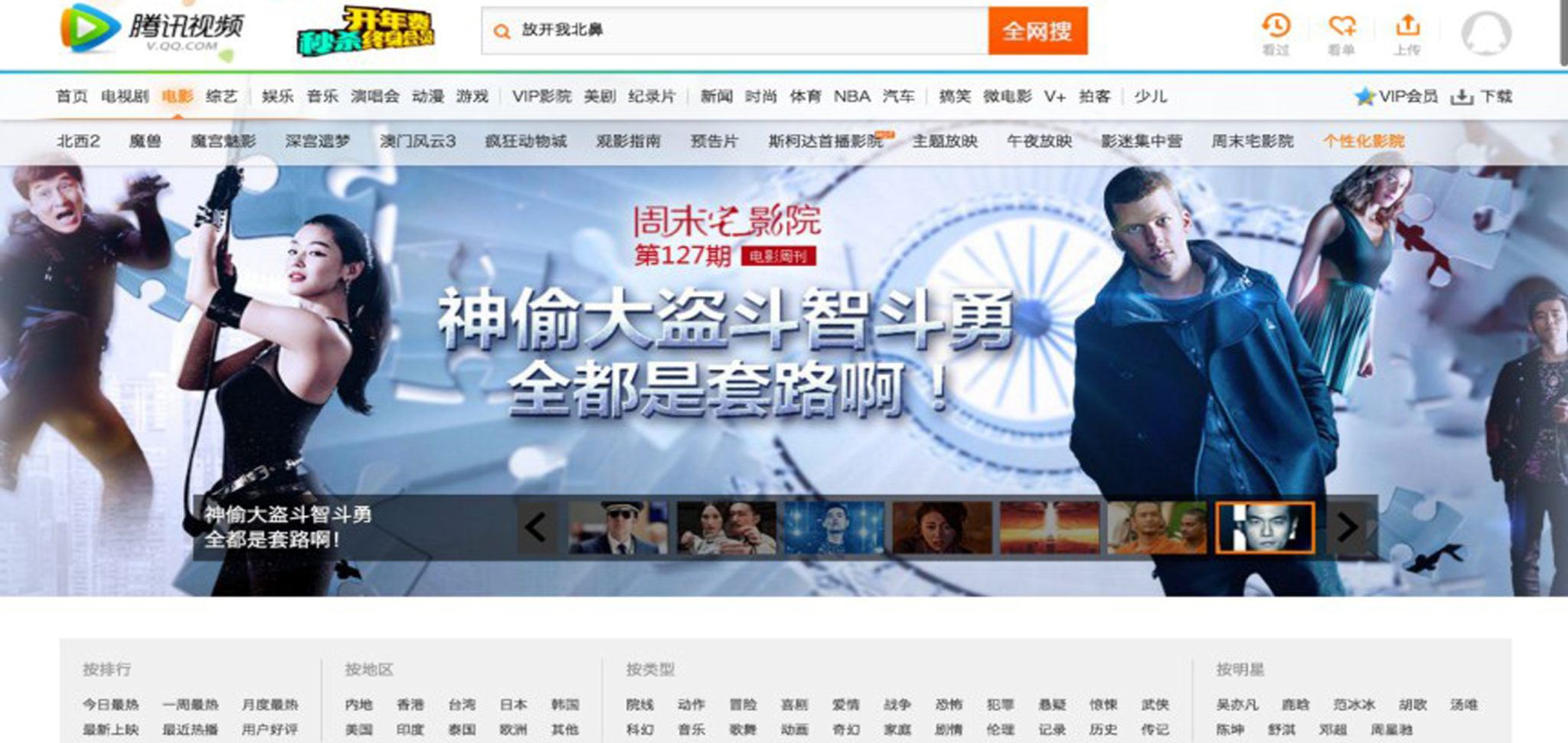
In the home page of Tencent QQ movie (for those who doesn’t know what Tencent QQ movie is, it is one of the popular Chinese movie and TV sites with free and paid movies and TV programs), we can see it is very lengthy, flashy, with lots of different navigation manual, sub-sections, categories, banners, links, and text.
The first eye-grabbing feature in the first section is certainly seeing a variety of choices of flashy banners with different movies/TV shows to choose from. This certainly can create a certain degree of excitement to more than 1.3 billions of Chinese Internet users to click and see which movie to choose from!
We can see the below whole picture (A page divided into 3 sections):
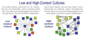
According to the cross-cultural research paper “A Cross-Cultural Comparative Study of Users’ Perceptions of a Webpage: With a Focus on the Cognitive Styles of Chinese, Koreans and Americans“ from Ying Dong and Kun-Pyo Lee (2008), it mentioned that the high context cultures such as China, Korea, Japan are holistically minded people who follow a non-linear readin g pattern, where low context cultures such as UK, USA, Germany are analytically-minded people who follow a linear reading pattern.
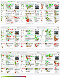
Holistically minded people and analytically minded people show different viewing patterns when viewing a web page. Holistically minded people show a tendency to spread their fixations over the page, where analytically minded people tend to concentrate their fixations while viewing the page.
According to the research findings, the American participants tended to read the prototype page in sequential order, while few of the Chinese and Korean participants showed any sequential reading patterns. On the contrary, the Chinese and Korean participants were more likely to scan back and forth among the page contents, and they were more likely to scan the page in a circular pattern.
Chinese and Korean participants were not really reading carefully, but just randomly scanning the page because they are holistically minded people, who have a tendency to see such a field as a whole and scan in a circular pattern, so we would expect them to use a strategy in which they perceive the web page by scanning across each information box.
In contrast, the American participants were also likely to focus on the page title and likely to read the navigation bar, while few of the Chinese or Korean participants did so. Analytically minded people are inclined to think in categories, so knowing what kinds of categories a website has would help them to perceive that website efficiently.
This shows that the cognitive reasoning and interpretation among the Eastern cultures such as Chinese and Korean are different from countries such as the UK, the USA, and Germany. For the Chinese market, a website design needs to adapt to the local users behaviors and what they are used to reading, browsing, and interpreting.
Language and character are different
 The Chinese character is indeed complex. As it is formed by strokes which make it more visually complex. There is no space from one stroke to another (because all the strokes connect with each other), so the visual appearance of the Chinese character is far denser. Therefore, when you direct copy the English layout into the Chinese, the visual appearance will look completely different. The look/feel/taste of the design will change drastically. Therefore, there is a different set of “typography” element for Chinese design, and it is better for Native Chinese to design because the native Chinese can understand whether the =design piece makes sense to the Chinese customers or not.
Content edited by Red Digital China
References:
https://www.ijdesign.org/ojs/index.php/IJDesign/article/view/267/163


 rn counterpart

